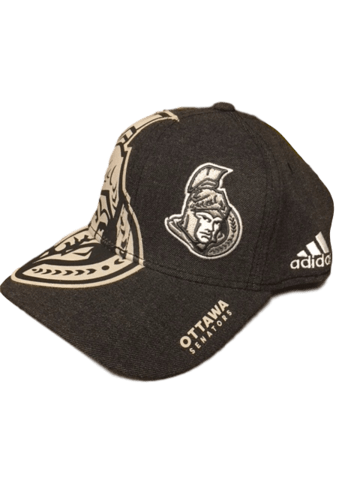
The “Where There Was Only One Set of Footprints”:

Luke’s Review: First of all, this hat’s curve is definitely illegal. Secondly, the main thing I want to say about that Lifetouch School Portrait lookin’ ass faded NHL logo in the background of the hat’s front panels, is that if I ever have to use the phrase “the background of the hat’s front panels”, you fucked up your conceptual design. It’s a hat; you’re not Vermeer reinventing the principles of composition.
Varada’s Review: You know what I like about sports? The reminder that my favorite team amounts to a premium mediocre franchise opportunity for shitty billionaires. I wonder why there are so few six-year-olds who ask for merchandise with the league logo on it for Xmas?
Chet’s Review: You guys are clearly too cynical for astrology but I’ll just point out that when the Sens logo transits across the NHL’s every 12 years or so, as this hat illustrates, it’s a good time to evaluate your life and take the leap on some major changes. I feel like that’s what the wearer of this hat is going to do when he comes to.
The Montage:

Luke’s Review: Look at this monochromatic disaster. It looks like something that was created as part of a movie tie-in for Fantastic Four: Rise of the Silver Surfer. Also, the only thing worse than the 3D centurion logo is the second, much larger 3D centurion logo made of heat transfer vinyl that will definitely start flaking off roughly 7 nanoseconds after it leaves the Sens Store.
Varada’s Review: This hat looks like it should appear in an in memoriam reel during the Oscars.
Chet’s Review: *yelling at ice lasers* FOCUS
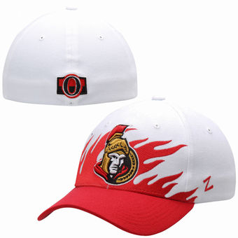
The Jammies:

Luke’s Review: This hat looks like it’s worn by children whose parents keep them on a leash when they’re at the mall.
Varada’s Review: Is this hat wearing pants? Is a person wearing a hat with pants excused from wearing human pants?
Chet’s Review: Party in the front, business in the back, logo we don’t really use anymore in the middle. Is this whole exercise just rating hats the Sens are trying to clear out before next year, when they have to be packaged up with those Dodgers and Falcons championship t-shirts and sent to a country where they don’t really care who won your league’s title because they’re too busy establishing democratic government? Cool, cool.

Luke’s Review: Pinstripes are a classic design element, but not so classic that they can’t be ruined by a logo made of granite countertop samples and superfluous red trim. The pinstripes are Ewan MacGregor and this hat is the Star Wars prequels.
Varada’s Review: All I can think of when I look at this is “Hello my baby / hello my honey / hello my rag-time gaaaaaaaal.”
Chet’s Review: This hat looks like Babe Ruth’s underpants.
The Canada’s Aging Fleet of Aircraft:

Luke’s Review: “You’re wearing a hat? I don’t see it! All I see is the Sens logo floating in the middle of your forehead! No seriously, where’s the hat?”
Varada’s Review: Putting your corporate team logo on the front and the flag on the side on a hat marketed to patriotic people seems ill-conceived.
The Craig Anderson:

Luke’s Review: This hat is actually kinda cool if you think looking like you’re re-entering the Earth’s atmosphere face first is kinda cool.
Varada’s Review: Even the logo on the front looks sort of miffed to be included in what amounts to a toddler’s idea of what looks cool.
Chet’s Review: These are speed holes. They make the hat go faster.
The 3D Magic Eye Poster:

Luke’s Review: There is not a single design element of this hat that isn’t completely hideous. This is the Sens hat we’ll all be wearing in the future when we’re living in a fascist police state.
Varada’s Review: You remember when DC killed Superman, and they brought back some other Supermen, one of which…WAS METAL? And his name was STEEL? No, I don’t remember that either. Never mind. Carry on.
The THX Surround Sound:

Luke’s Review: How many times are we going to fuck up a hat by cramming in too many (i.e. more than one) design elements? You can design a hat that says “OTTAWA SENATORS” or you can design a hat that has a big ol’ O logo on it, but under no circumstances should you just paste the O logo on OTTAWA SENATORS text because if you do this, you’ll have a hat that says OTTA=0=TORS. This hat is like putting peanut butter on smoked salmon.
Varada’s Review: If you showed somebody this design on a computer screen, and they didn’t know what the Ottawa Senators were, they would have questions. So how did this get from a computer screen and into production? Wait a minute…do the designers of these hats own computers?
Chet’s Review: When you want to hit the club but bring your screensaver with you.
The Eye of Agamotto:

Luke’s Review: Glow-in-the-Dark Mini Putt lookin’ ass hat.
Varada’s Review: Predator-vision lookin’ ass hat.
Chet’s Review: Your Char Broil InfraRed GrillZone (TM) is ready to incinerate your steak lookin’ ass hat.
The Discount Upholstery:

Luke’s Review: Official Hat of Dads Who Have To Wear The Stuff Their Kids “Bought” Them On Father’s Day.
Varada’s Review: I’m just curious to know what’s on the side. If the front is this shameful, then I need to know what they’re so ashamed of that they won’t even show it.
Chet’s Review: Is this hat… medical? Is this a… medical hat?
The Eric Gryba:

Luke’s Review: Sometimes I look at a hat and think, “Who is this for?” I know who this hat is for. This hat is for Eric Gryba. 6 out of 10.
Varada’s Review: The people who wear this hat who wish they were in the military could hang out with the people who wear that military hat from earlier, who also wish they were in the military, and they could talk about how Trudeau wants to tax cell phones or whatever conspiracy theory the Rebel sold them this week.
Chet’s Review: At least this is a full camo hat. This is the hat you wear when you need to go undetected, like when you’re skulking up to the window of your own house to see your partner enjoying a crisp glass of chardonnay with someone in a cooler hat.
The Medieval Times:

Luke’s Review: This is the only hat on this list that I find physically painful to look at. This looks like something a trust fund baby would wear on a golf course before driving home drunk.
Varada’s Review: While this hat is extremely ugly, it gets points for being very good for straining pasta.
Chet’s Review: This hat is like you’re at the cottage, trying to point the rabbit ears on a 1980s Zenith TV, and you hit just the right angle for a second and, through the static, you catch the faint sound of… danger flutes. But that scenario is still cooler than this hat, even though in both you’re completely drunk.
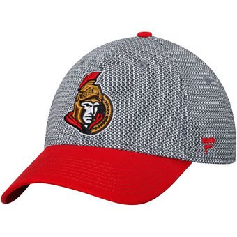
The Gas Station Knock-Off, But, Like, It’s Real:

Luke’s Review: “What if the 2001 MTV Video Music Awards were a Sens hat?”
Varada’s Review: As with almost all of these hats, you could imagine this approaching acceptability and then they just fucking ruin it. Greyscale hat with black brim? Ok. White logo with red outline. Fucking pushing it, but fine. DIAGONAL LOWERCASE ‘SENATORS’ IN A FONT IN WHICH THAT WORD HAS NEVER APPEARED ON A SURFACE THAT NEVER DISPLAYS TYPE??? This is like making an intricate meal and then, because you can’t just leave well enough alone, you add one last dash of paprika and all you taste is paprika.
Chet’s Review: Whenever Senators isn’t on screen, all the other characters should be asking, “Where’s Senators?”
The Gladiator Who is Worried About His Finances:

Luke’s Review: This hat is nearly good, but for some reason the role of 3D Centurion Logo is being played by Fred Armisen.
Varada’s Review: That they didn’t fuck up the brim or cap and I still wouldn’t wear the logo of my favorite team really draws attention to the fact that the Sens have one of the worst logos in the NHL.
Chet’s Review: This is like if a hat was your dad watching you change a tire.
The Actually Only Good One of the Lot and It’s Sold Out:

Luke’s Review: Classic logo on a plain background. The tuxedo of Sens hats, if Tapout made tuxedos.
Varada’s Review: “Gongshow” bwahahahaha
Conclusion: It’s a bad sign when all of your team’s official headgear is getting aesthetically dunked on by blogger merchandise.

So the Cubs won last year; I get my computer-impaired 82-year old mother a hat, as neither of us is likely to live long enough for it happen again. It’s a lovely hat, with gold and silver embroidery, and it fits and all. Pens win. I get myself a hat–same price as my mom’s, identical to the (ugly) one they gave the team the night they won. No metallic thread. And somehow it never shapes to my head. Hats may be part of the Big Lie. Sports are pain, highness.
This was a thoughtful, loving article. I hope you get better hats.
While wearing the Eric Gryba I looked into the eyes of the deer I just killed in the neck with a crossbow and noticed that the beast actually pitied me.
Pingback: PHT Morning Skate: Why are there so many empty seats at Red Wings games? – ProHockeyTalk
Pingback: Neden Kırmızı Kanatlarda çok boş alan var?
I see you don’t monetize your page, don’t waste
your traffic, you can earn additional bucks every
month because you’ve got hi quality content. If you want to know how to make extra $$$,
search for: Boorfe’s tips best adsense alternative
I try to read this once a year